10 New Ways to Visualize User-Generated Content with Event Technology
Mobile devices and social media technology makes it easy to create attendee engagement experiences in our events.
You can capture polls, votes, surveys, ideas, questions, photos and much more through event apps, audience response apps, social media, SMS, tablet activations and much more.
In return, there are many fun, animated displays that will display user-generated content in real time back to the audience. Here are 10 user-generated content visualizations that will forever change the way you use event technology to show user-generated content at your events.
1. Circle Poll Chart
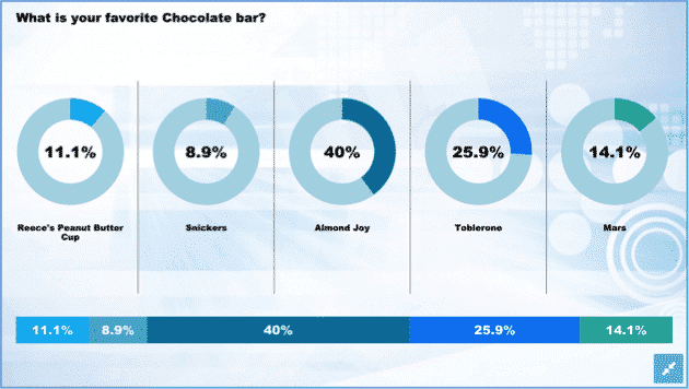
The Circle chart is a fresh take on showing poll results from an audience response app. The circles and the connected bar at the bottom of the screen give your results more of a modern look.
Using bar charts to show poll results is kind of like wearing mom jeans to a fashion show. You can do it, but friends don’t let friends do that.
Use the circle chart instead.
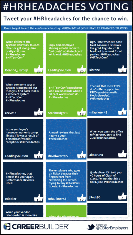
2. Scrollable Idea Voting Screen (Mobile)
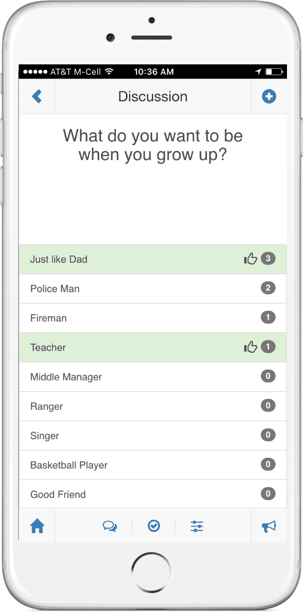
Businesses run on ideas and input from employees, customers and partners. Being able to capture and show ideas collected from the attendees in the room via your audience response app is powerful. Plus, you may want to allow people to vote on those ideas as well.
This screen is a simple way to visualize the ideas collected (and moderated) from the audience, then allow them to vote for their favorites.
3. Scrollable Idea Voting Screen (Big Screen)
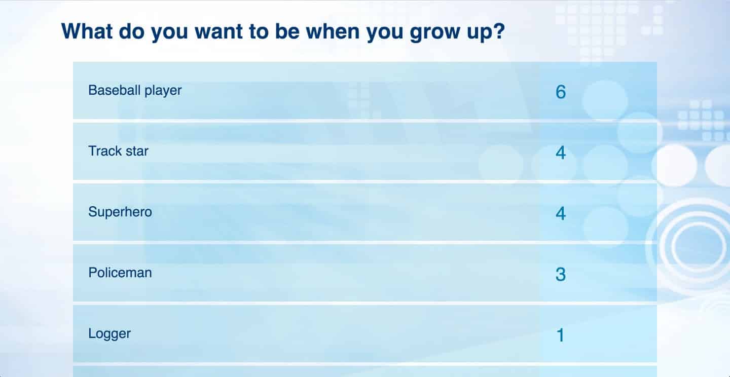
It’s one thing to show ideas on the event app. What if your session speaker or facilitator wants to show the ideas collected from the audience response app on the big screen? Using this visualization, attendees will be able to see the collective ideas, while the facilitator and the group discuss a single idea.
This is helpful for two reasons: (1) You can focus the attendees’s attention on the screen instead of their mobile devices. And (2) you can include attendees who are not participating via the audience response app or your event app.
4. Interactive Q&A Question Display
Interactive Q&A is a staple of every conference session. Today’s event technology and audience response apps makes it easy to collect questions from the audience, select the order of the questions to push those questions to the big screen or confidence monitor.
5. Wordcloud
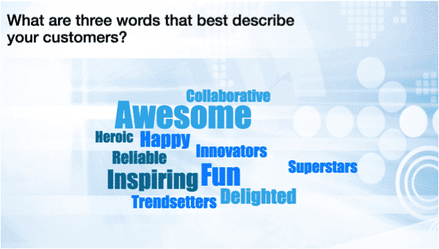
Who doesn’t love a wordcloud? The Wordcloud is a great way to capture themes in attendee’s comments from the audience response app. People love to see how their comments can be summarized and presented in these types of visualizations. It’s great for attendee engagement!
We have noticed that wordclouds get the best results when you ask attendees to share 1 to 3 words in the audience response app.
6. Caption This
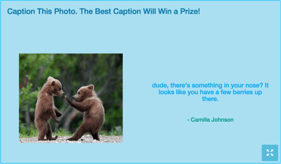
One of the fun visualizations that we created is the ability for attendees to caption photos. “Caption This” is a simple and fun way to get the energy going in the audience and discover who has witty comments.
7. Trivia Leaderboard
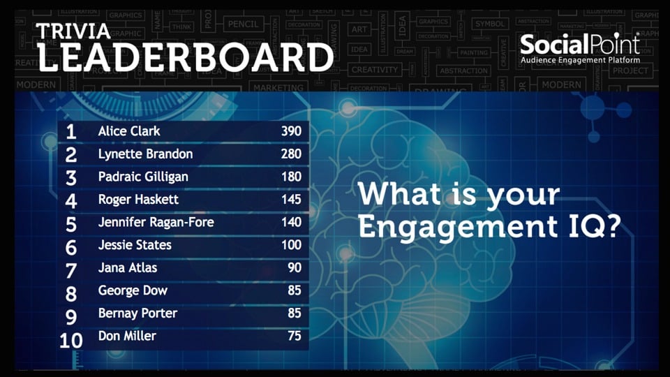
People love to see their name in lights. Putting an attendee’s name or a team name on the leaderboard will get your attendees excited. There are several ways to put together and brand team-based trivia leaderboards.
Trivia games work with individual or team game play. Also, trivia games can work well in conference sessions or in experiential marketing spaces.
Read: How Trade Show Booth Leaderboards Drive Repeat Booth Visits
8a. Social Media Wall and Digital Photo Wall
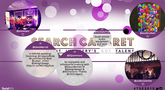
The only thing attendees love more than seeing their name on the big screen is seeing their picture. Today’s social and mobile technology makes it easy for attendees to take selfies and share them publicly via social media or privately through your audience response app. Social Media walls and Digital Photo walls make it easy to curate this user-generated content and show it on the big screen.
There are several different ways that you can create branded visual screens to show these photos. The Burst visualization shown above displays content in bubbles that then explode into many smaller bubbles. This screen can be very mesmerizing. Click to see more options.
8b. Social Wall (Flip Grid)
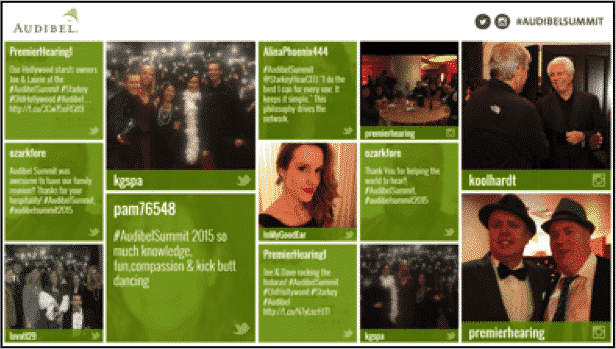
Corporate clients love grid-type templates. Showing social media wall content in a grid that is animated is very popular. There are several different ways that you can configure these templates for branding, animation and look and feel.
9. Social Media Leaderboard
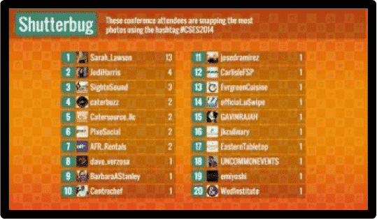
If you want to drive audience participation and sharing with social media, a social media leaderboard is a great way to energize the audience. Leaderboards can be built out of several different types of attendee engagement behaviors. To make the social media leaderboards look alive — we recommend creating leaderboards around 3-5 different social behaviors, then set those leaderboards to scroll every 10-20 seconds.
10. Live Metrics
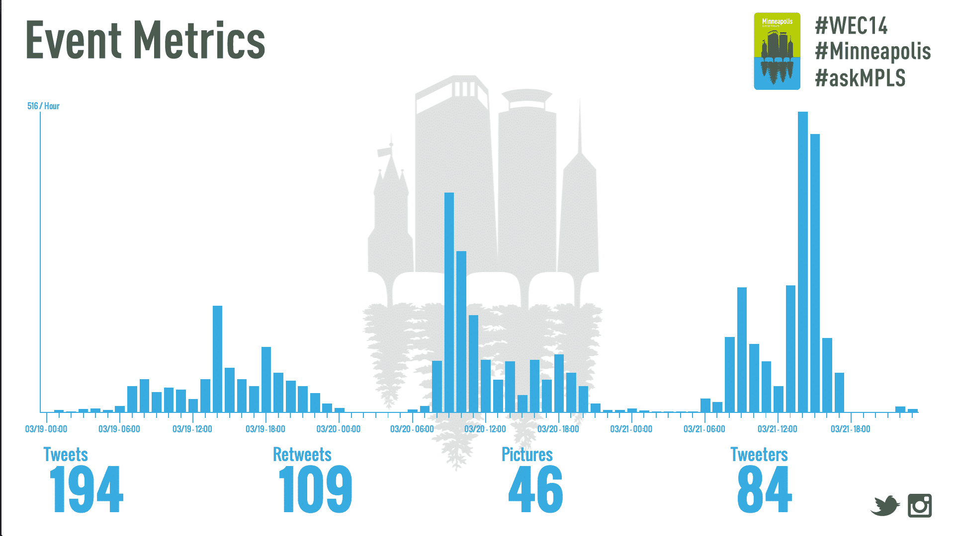
Live metrics are a great way to show the scale of a social media conversation. These visualizations, compliment your social media wall and show the power of the collective attendees to contribute to a conversation online and have an impact.
BONUS: Idea Voting Touchscreen
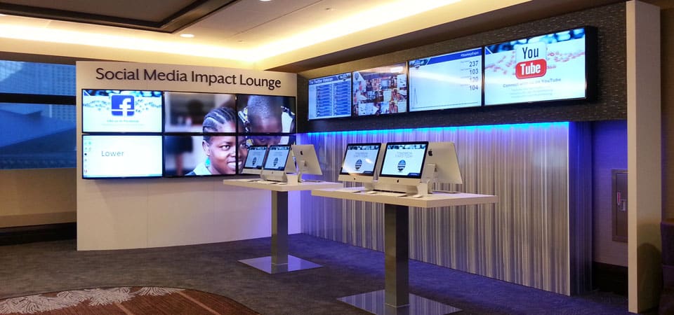
An Idea Voting Touchscreen is a great way to view content in an experiential space, whether you have a resource fair, lounge or even a hallway space. This touchscreen event technology creates a simple way to visualize ideas on a big screen and allow attendees to interact with them.
Conclusion
Tapping into the collective wisdom of your attendees and showing their user-generated content is a fun way to activate attendees and turn them into active participants.
While audience response polling has been around for more than 25 years, today’s mobile, social media and event technology creates many fun, new ways to visualize user generated content in your events.
Have an awesome next event!
If you’d like to see more about how you can integrate user-generated content into your event, feel free to contact us with questions or to discuss your event with one of SocialPoint’s Digital Strategists. We’ll help you generate greater attendee engagement at your events.

